
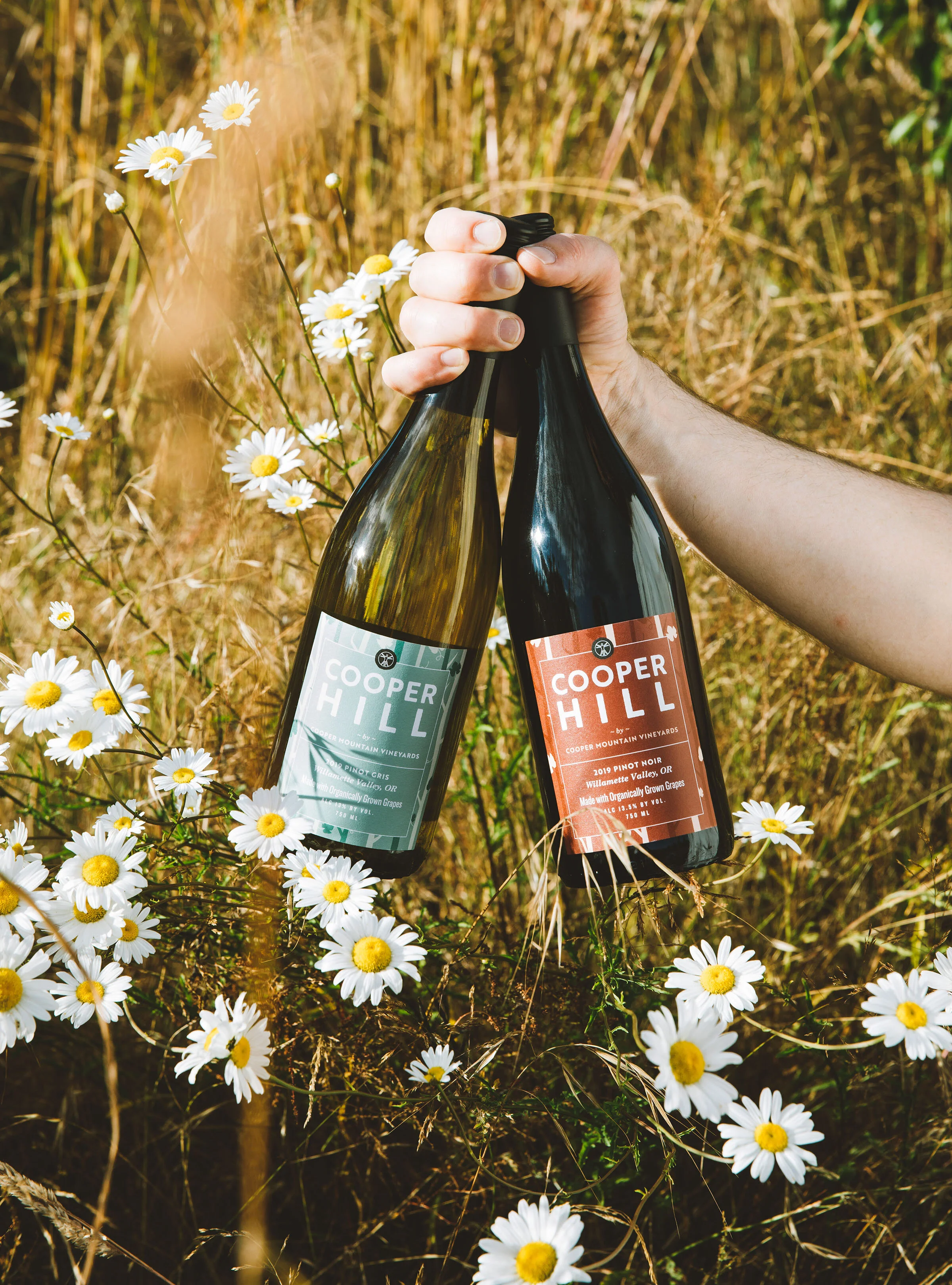
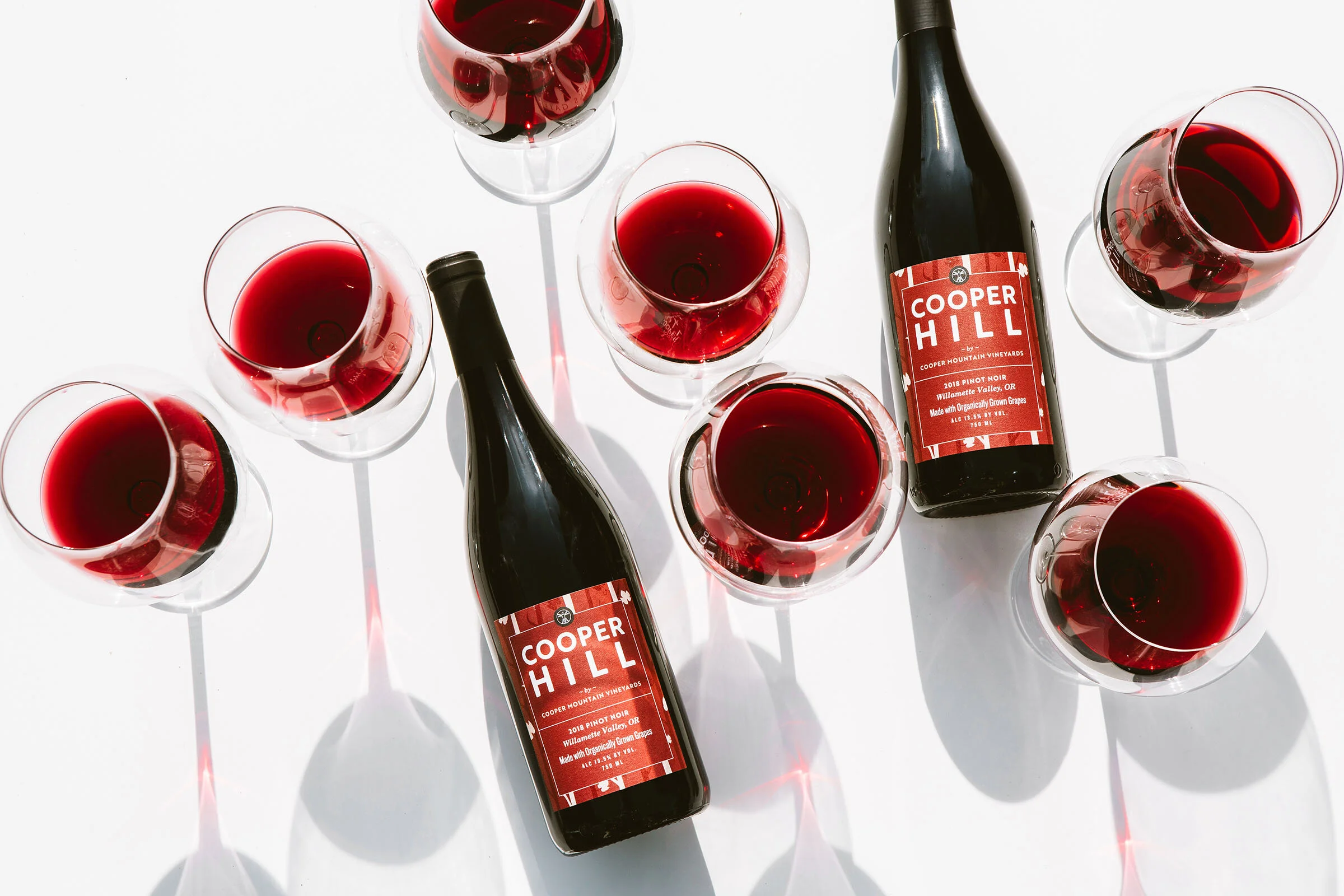


I had the honor of working with Michelle Battista (of Stockpot Co. and The Nightwood Society) to redesign Cooper Hill’s familiar labels, well-known across the wine racks of the Northwest. It was important to the client to retain the recognizable stripes which they considered to be part of their brand DNA, and after a thorough discovery process we landed upon a reinterpretation of the stripes as leafy vines creating a subtle background to a new, bolder type treatment. The new color palette is influenced by the earthy tones of the PNW—and of course by the wines themselves.
As part of the label design, we created an updated version of the Vitruvian Man icon that represents their biodynamic winemaking practices.
In addition to being a fun project resulting in stellar product shots, this project had the distinction of producing the largest number of iterations which I would personally have been delighted to see in the wild. The brief requested a colorful and eye-catching design: graphic, youthful, and incorporating the signature stripes. Throughout many draft design rounds, we explored a multitude of different interpretations of this brief—all of which resulted in at least a few concepts that I think deserve to be shown off. I really let my love for explosive color run wild in this project. Enjoy!
Photos: Cheryl Juetten (for Cooper Mountain Vineyards)